Launching a startup is already a marathon. Your website shouldn’t be another obstacle.
You don’t need 20 pages, endless features, or a massive budget. But you do need a site that looks legit, builds trust fast, and makes it insanely easy for people to understand what you offer.
Some pages are non-negotiable, whether you’re selling a product, offering a service, or testing your MVP.
In this post, we’ll walk you through the essential pages for startup website success.
Just the five that matter most, nothing you don’t need, and everything you do.
If you’re a first-time founder, tight on time, or already wearing 10 hats (sound familiar?), this guide’s for you.
Let’s keep it simple and get it right.
What are the essential pages for startup website?
Here’s the short list:
- Homepage – Your elevator pitch
- About Page – Builds trust and tells your story
- Services or Products Page – Clearly shows what you offer
- Contact Page – Makes it easy for people to reach you
- FAQ or Testimonials – Removes doubt and builds confidence
These are the core five. Nail them, and you’re ahead of most startup websites already.
Why Website Structure Matters for Startups
When you’re running a startup, every click counts.
People don’t have time to “figure out” what you do.
If your site’s confusing, cluttered, or missing key info, they’re gone.
That’s why structure matters.
Think of your website like a pitch deck, but faster.
You’ve got seconds to make a first impression, build trust, and guide someone to take action.
A well-structured site with the essential pages for startup website success does three things:
- Tells people exactly what you offer
- Proves you’re credible
- Makes it easy to take the next step
There is no fluff, no filler, just a lean, clear experience that turns visitors into customers or at least gets them that first email or call.
Now let’s break down the five pages every startup should have (yes, even if you’re still in the early stages).
1. Homepage – Your First Impression and Elevator Pitch
For startups, especially early-stage ones, your homepage isn’t just a welcome mat.
It’s your one-shot pitch, making it one of the most crucial among the essential pages for startup website success.
What it needs to do:
- Clearly articulate what your product or service offers.
- Demonstrate immediate value to the visitor.
- Provide a straightforward call-to-action (CTA) guiding the next step.
What to include:
- A compelling, concise value proposition at the top.
- A brief introduction or explainer to pique interest.
- Social proof or results (e.g., testimonials, client logos).
- A prominent CTA above the fold.
Real-World Examples:
B2B Example: Forethought
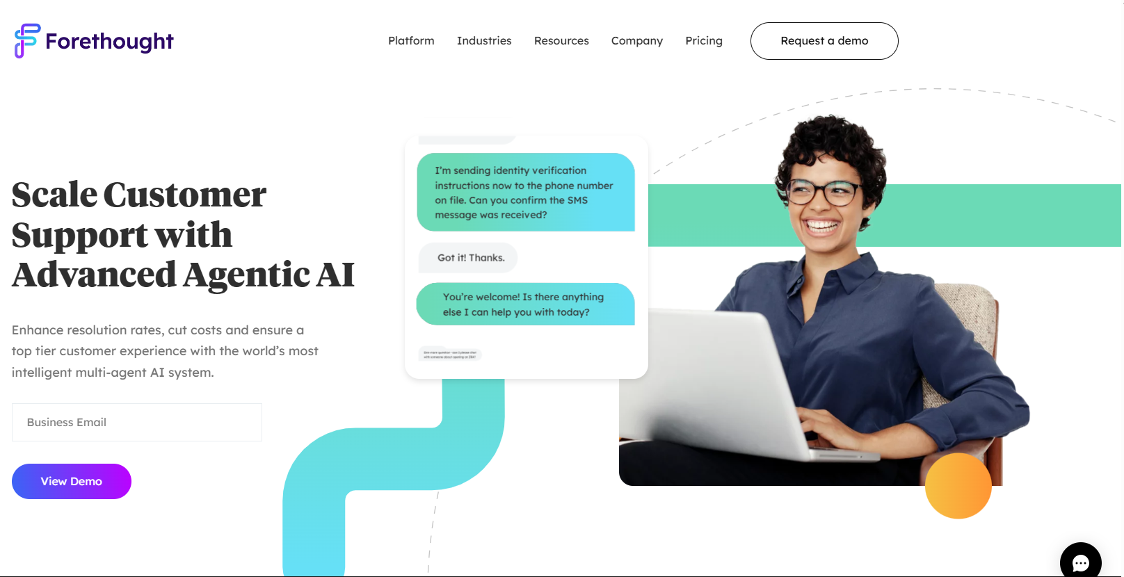
Forethought’s homepage is a solid example of how B2B startups should approach clarity and credibility.
It immediately hits you with a crystal-clear headline: “AI-First Customer Support,” no jargon, just the core value.
Below that, they reinforce trust with logos of well-known customers like Instacart and Carta.
As you scroll, you see clean sections explaining what the platform does, who it’s for, and what results it delivers.
The design is modern, spaced out, and focused.
There is no clutter, and storytelling is well-paced with action-driven CTAs like “Get a Demo.”
If you’re a B2B startup, this is how you show authority without overwhelming visitors.
B2C Example: Bite Toothpaste Bits
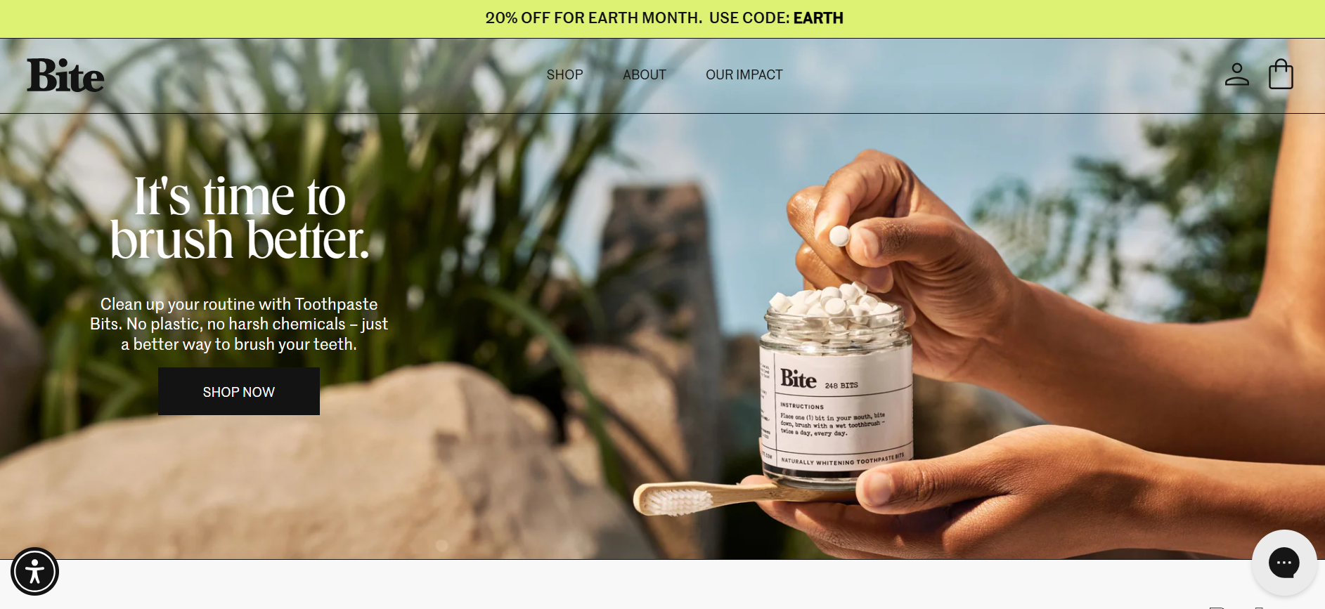
Bite’s homepage gets right to the point: “Plastic-Free. Clean. Effective.”
In just five words, it tells you exactly what the product is and why it matters.
The design is bold, scrollable, and loaded with lifestyle visuals that show the product in real-life use.
There’s social proof via reviews and press features (Forbes, Vogue), plus easy-to-skim benefits like “Refillable,” “Travel-Friendly,” and “Zero Waste.”
The primary CTA “Shop Now” is easy to find and hard to ignore.
This is how a consumer brand quickly builds interest:
Say less, show more, and make buying easy.
2. About Page – Build Trust Fast
Let’s be honest: no one wants to read a corporate novel.
But they do want to know who’s behind the business, and why they should trust you.
That’s why the About page is one of the most essential pages for startup website success.
This is where you build credibility and connect, especially if you’re still new and building your name.
What to include:
- A short, honest intro about why you exist
- Who you are (even if it’s just two co-founders and a dog)
- Your mission or beliefs: keep it human, not buzzwordy
- Any proof that you’re the real deal: press, awards, milestones
- A CTA. Yes, even here (contact, shop, demo, etc.)
Real-World Examples:
B2B Example: Buffer
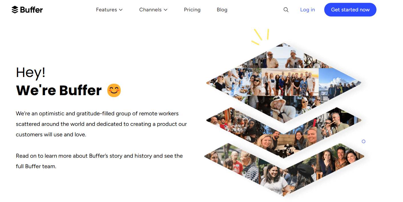 Buffer nails the B2B About page. It starts with a clear, human-centered mission: “To help small businesses thrive.”
Then it introduces the team, shares core values, and even includes financial transparency and diversity stats.
It feels honest, open, and refreshingly personal, rare in the SaaS space.
This makes it perfect for a startup looking to build long-term trust.
B2C Example: Chubbies
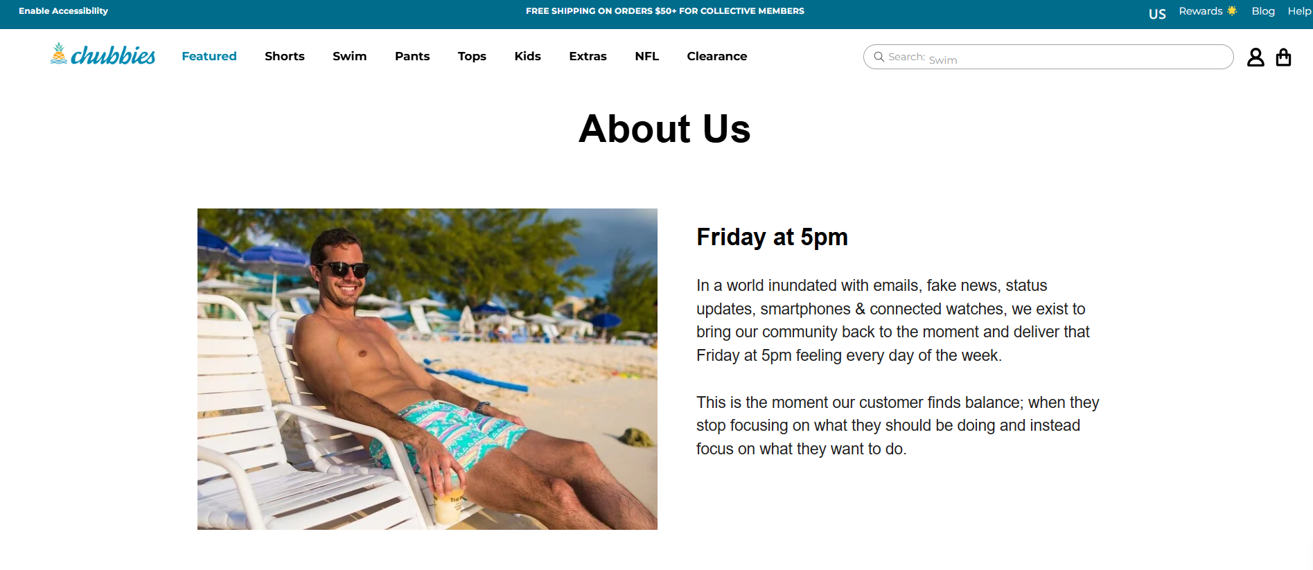
Chubbies leans into humor and brand personality big time.
Their About page starts: “We exist to bring you the weekend. Every day.”
It’s bold, fun, and totally aligned with their product.
They mix storytelling with culture, explaining their vibe and why they’re different.
The tone matches their audience; by the end, you know exactly who they are (and want to be part of it).
No matter your vibe, serious or playful, the goal is the same:
Show your face, share your "why," and make it easy for someone to say, “Yeah, I trust these people.”
Need help figuring out what to include on your site?
Check out our guide on Must-Have Features for a Small Business Website. Especially useful if you’re building your first site and don’t want to miss the basics.
3. Services or Products Page – Show What You Actually Do
You’d be surprised how many startup websites don’t explain what they offer clearly.
Your Services or Products page is where you stop being “interesting” and start being useful.
It’s one of the most essential pages for startup website results because it answers the question every visitor is asking:
“Can this solve my problem?”
What this page needs to do:
- Clearly list what you offer, don’t make people guess
- Explain benefits, not just features
- Use visuals (photos, icons, or quick demos) to show value
- Make it easy to take the next step (buy, book, sign up)
If You’re a Service-Based Startup:
Break your services down into bite-sized, skimmable chunks:
- Name of the service
- Who it’s for
- What’s included
- Optional: Pricing, if you’re transparent about it
- Strong CTA (e.g., “Schedule a Call” or “Request a Quote”)
If You’re a Product-Based Startup:
- Use product categories or filters to keep things clean
- Highlight best-sellers or bundles up top
- Include social proof (reviews, UGC, trust badges)
- CTA should be short and action-driven: “Buy Now” > “Learn More”
Real-World Examples:
B2B Example: Miro
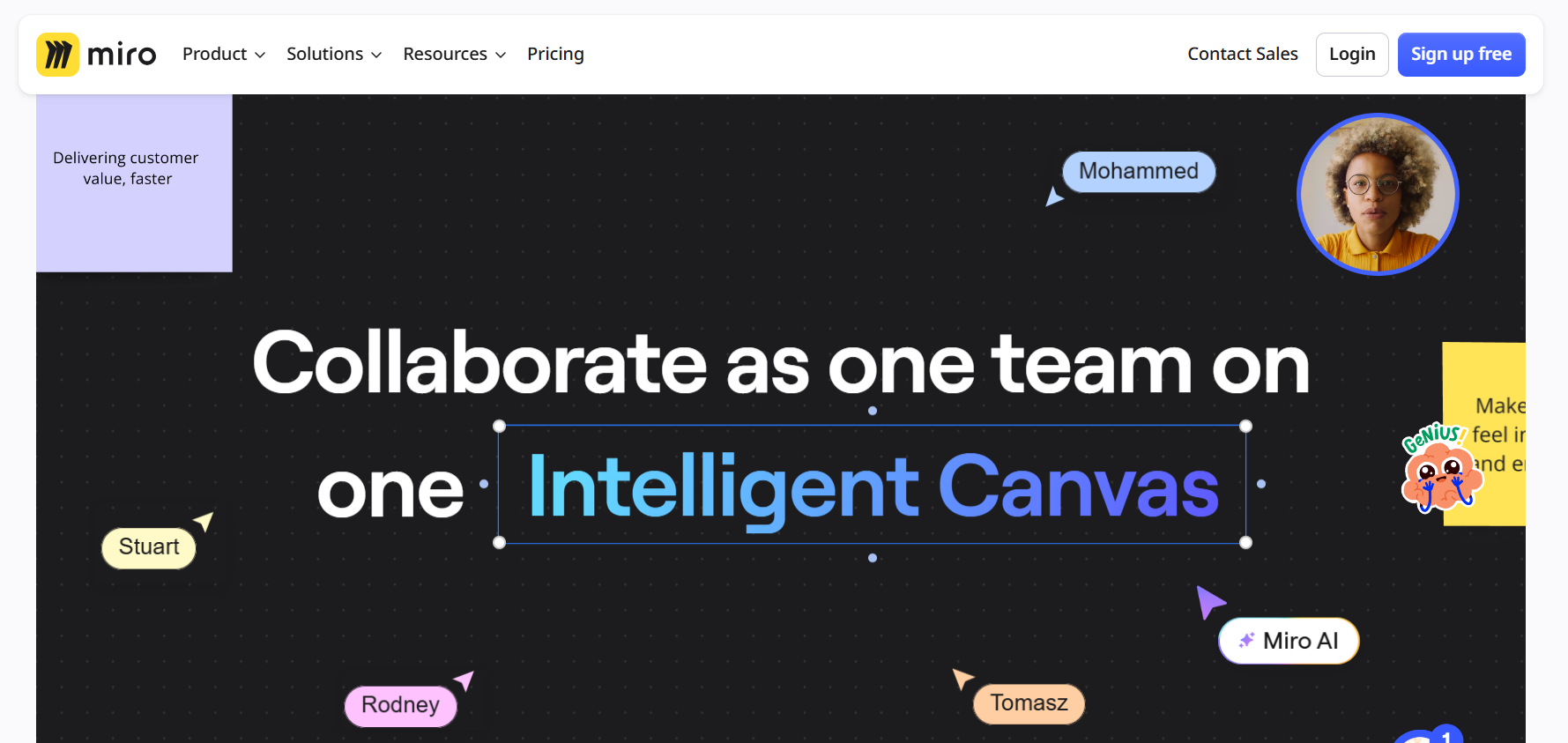
Miro’s product page is a masterclass in clarity and engagement.
The page features interactive elements, including a live platform demo, allowing visitors to experience the product firsthand.
Clear sections detail features, use cases, and integrations, all supported by concise copy and visuals.
CTAs like “Sign up free” are strategically placed to guide users toward conversion.
B2C Example: Bloom Nutrition
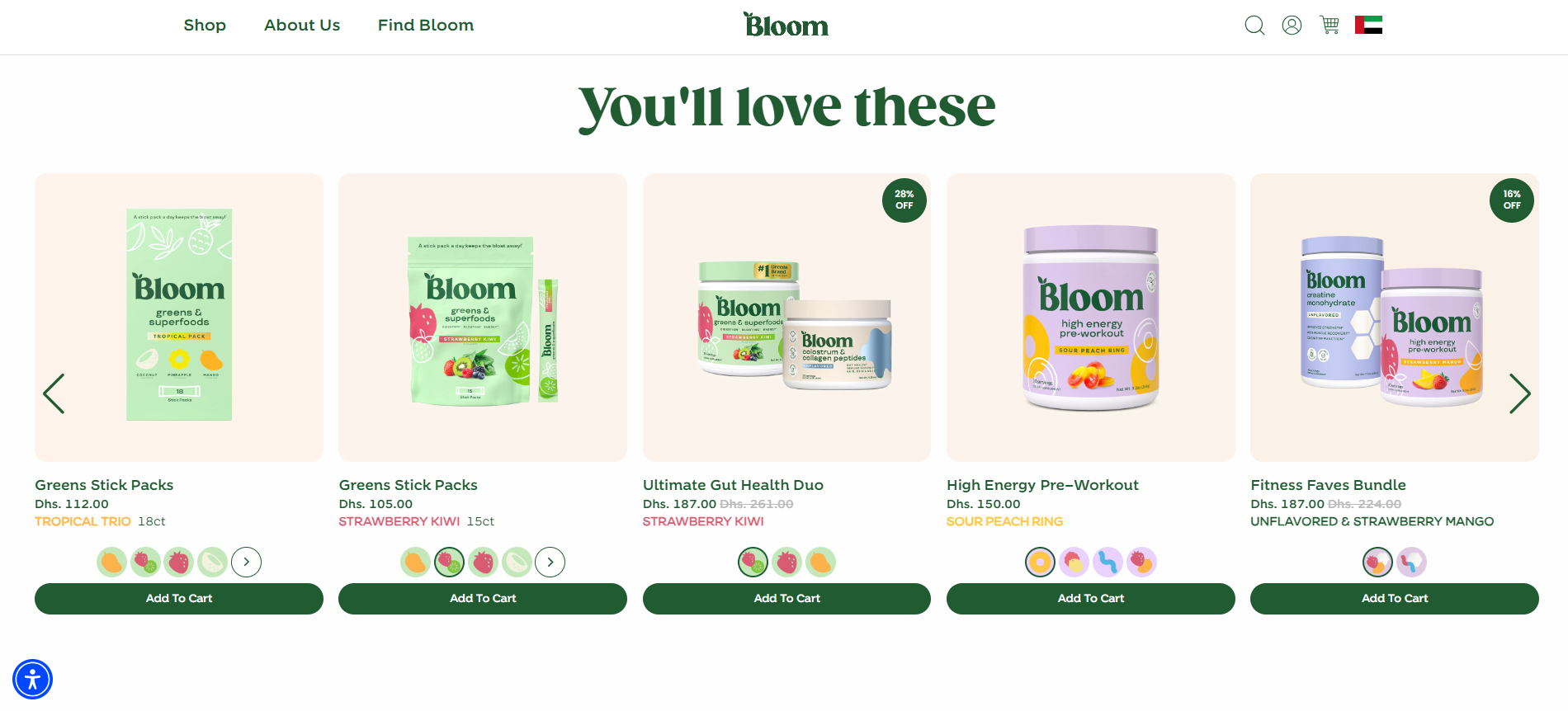
Bloom Nutrition’s product pages are designed with the customer in mind.
Each page showcases high-quality images of the product, accompanied by key benefits like “gluten-free,” “plant-based,” and “dairy-free,” highlighted prominently.
Customization options for flavor and size are easily accessible through dropdown menus, simplifying the selection process.
Social proof is provided via user-generated content, including photos and videos, building trust and community.
The “Add to Cart” button prominently displays, streamlining the purchasing process.
Don’t overload this page. Your goal isn’t to say everything. Just enough to show value and get the user to act.
Still unsure whether you need a full site or something simpler?
This post on One-Page Website for Small Business breaks down exactly when a streamlined approach is better, and how it can save you time and stress.
4. Contact Page – Remove Friction, Get the Call
You’ve caught their attention, earned some trust, and now they’re ready to reach out.
The last thing you want is to make that hard.
Your contact page should be the easiest, cleanest part of your entire site.
It’s one of the essential pages for startup website success because when someone’s ready to connect, you don’t want to lose them.
What to include:
- A short headline that invites action (“Let’s Talk” or “Have a Question?” works fine)
- A contact form (keep it simple: name, email, message)
- Direct contact details: email, phone, WhatsApp (whatever you use)
- Your physical location (if it matters to your business)
- Optional: Business hours, social media links, and map
Keep it frictionless:
- No captcha walls unless you’re drowning in spam
- No long forms. Only ask for what you really need
- If you use chatbots or live chat, make sure they work well on mobile
Real-World Example:
B2B Example: Webflow
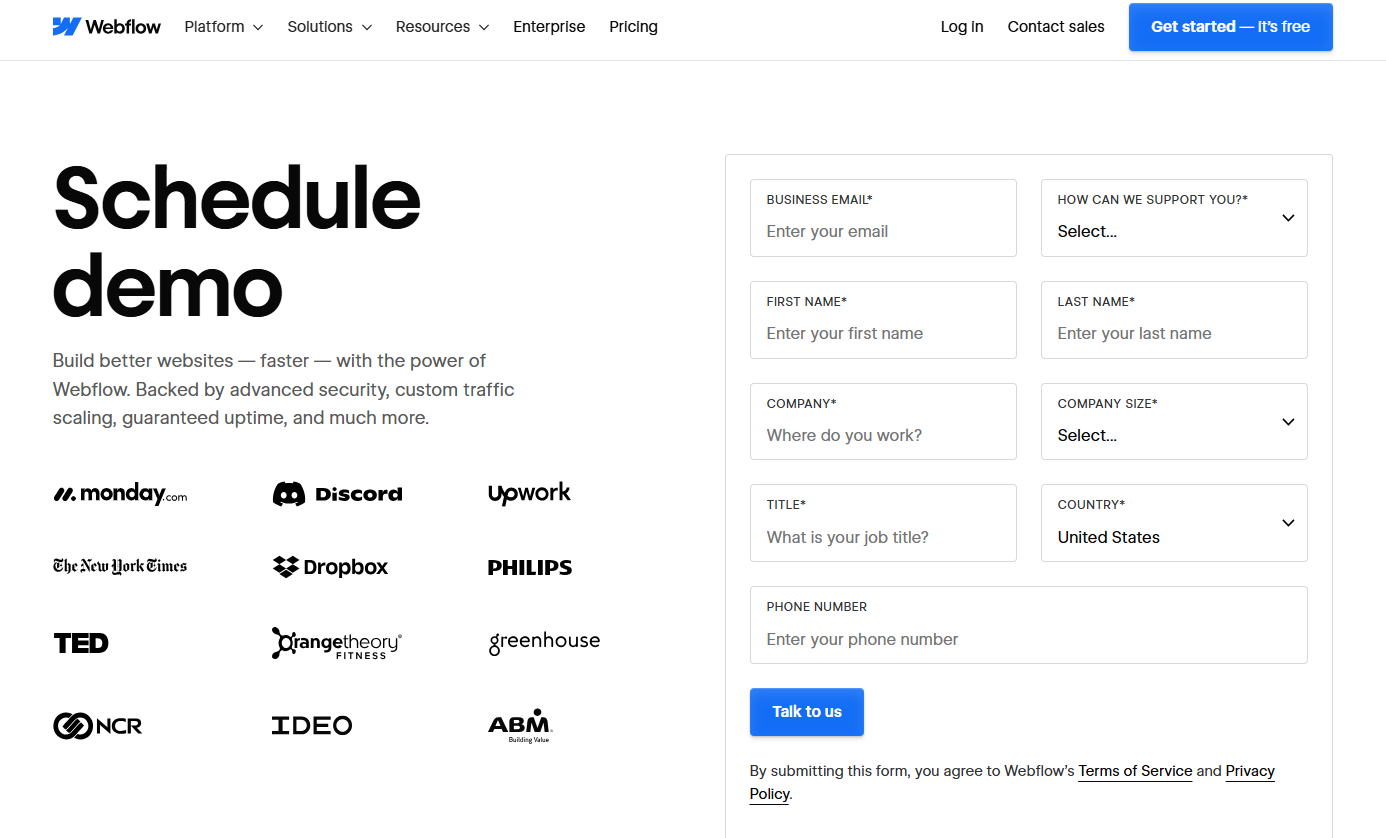
Webflow’s contact page is minimal but efficient.
Clear CTAs guide visitors to support, sales, or the help center.
It’s smartly segmented based on intent, so users don’t waste time.
The design feels human, not corporate.
B2C Example: Allbirds
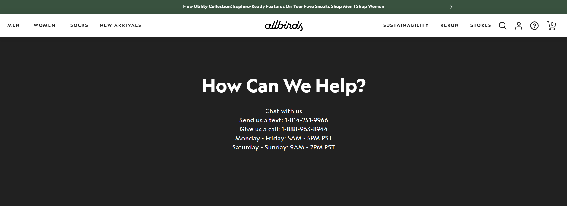
Allbirds keeps its contact page simple, friendly, and focused.
They offer multiple ways to get in touch: email, SMS, and even a help center.
Plus, the tone stays warm and conversational, matching their brand voice perfectly.
Don’t hide your contact page in the footer. Make it easy to find in your nav bar—because people looking to contact you are already halfway converted.
5. FAQ or Testimonials Page – Build Confidence, Save Time
This is the trust builder. It’s the page that answers the questions people are thinking but not always asking, and one of the most underrated essential pages for startup website success.
Whether it’s an FAQ section or a page of testimonials (or both), this part of your site helps you overcome doubt, reduce hesitation, and move people closer to a “yes.”
Option 1: FAQ Page (Frequently Asked Questions)
This is perfect if:
- Your product or service is new or not widely understood
- You get the same questions over and over
- You want to reduce support requests and buyer hesitation
What to include:
- How it works
- Pricing/billing questions
- Shipping, return, or delivery info
- “What if…” scenarios (e.g., “What if I’m not satisfied?”)
- Product/service-specific details
Write answers like you're explaining to a smart friend, not like a lawyer.
Option 2: Testimonials or Reviews Page
If you’ve got happy users, show them off. Testimonials are one of the fastest ways to build trust, especially if you’re still new.
What works best:
- Real names + photos (video is even better)
- Short quotes focused on results or experience
- Industry or role context (e.g., “As a startup founder, I needed…”)
Whether it’s FAQs, testimonials, or both, this page isn’t “extra.” It’s part of what helps a stranger trust you enough to click “Buy” or “Book.”
Blog or Resources Page – If You’re Playing the Long Game
While not one of the core five, a blog can be a powerful addition to the essential pages for startup website growth.
Not every startup needs a blog, but if you’re serious about SEO, building authority, or educating your customers, this page is a game-changer.
Think of it like this: while your product pages do the selling, your blog builds the trust.
Why it’s worth considering:
- Helps you rank on Google for more keywords
- Answers common questions before they become objections
- Shows expertise in your space
- Gives people a reason to come back to your site
If you don’t have the time to blog weekly, that’s fine. Even 2–3 well-written posts can give your website some traction and make you look more established than you are.
A blog post like “How to Choose the Right CRM as a Startup” or “The Real Cost of Hiring a Marketing Agency” can bring the exact people you want right to your site.
Build Less, Win More
When you’re launching, you don’t need a fancy website. You need a focused one.
The truth? Most startups waste time building pages that no one visits. Don’t do that.
Instead, stick to these essential pages for startup website success:
- Homepage
- About
- Services or Products
- Contact
- FAQ or Testimonials
(+ Bonus: Blog)
Build with purpose. Launch fast. Improve later.
Need Help Getting Started?
You’ve got a business to build. Your website shouldn’t slow you down.
That’s where Websity Digital comes in.
We specialize in building websites for founders who need to move fast, keep it lean, and still look sharp. Whether you’re launching a product, offering a service, or still validating your idea, we help you get online with clarity, confidence, and zero tech overwhelm.
- No bloated builds.
- No endless revisions.
- Just clean, effective sites that do what they’re supposed to: convert.
From one-page sites to full startup-ready platforms, we’ll help you figure out what you actually need, and skip what you don’t.