

Let’s not sugarcoat it: most people visiting your website right now are doing it on their phone.
If your site isn’t built for that screen first, you’re not just behind, you’re actively losing leads, frustrating customers, and giving your competitors an edge.
Mobile-first design for small business isn’t a “nice to have” in 2025, it’s the baseline.
Google expects it.
Customers expect it.
And if your site doesn’t deliver, they’re gone in seconds.
The good news? You don’t need a full rebuild to fix it.
This post will show you what mobile-first actually means, why it matters more than ever, and how to get there, without starting from scratch.
Let’s make your site work where your customers already are.
1. What Mobile-First Really Means
Let’s clear something up:
Mobile-friendly and mobile-first are not the same thing.
A lot of small business websites were built for desktop and later “made responsive,” which usually means stacking everything vertically and hoping it doesn’t break. That’s mobile-friendly.
Mobile-first design flips that. It means you start designing for the smallest screen, then scale up from there.
What mobile-first design actually means:
- Prioritizing content that matters most on small screens
- Making everything tappable, scrollable, and readable without zooming
- Fast load times, even on spotty mobile connections
- Clean layouts that don’t get cluttered when space is tight
Think of it this way: You’re not shrinking the desktop version, you’re building the phone version on purpose.
For founders, this is key: your customers aren’t browsing your site on a 27″ monitor.
They’re on the train, at the kitchen table, or waiting in line, scrolling on their phones. Your site needs to meet them there.
2. Why It Matters for Small Businesses
Here’s the reality: big brands can get away with average websites. You can’t.
If someone’s checking out your business online, they’re probably:
- On their phone
- In a hurry
- Comparing you to someone else
If your website doesn’t load quickly, isn’t easy to navigate, or just looks off, it’s game over.
Here’s why mobile-first design for small business matters:
- It’s where the traffic is
Over 60% of website visits come from mobile. And for local or service-based businesses, that number is often higher. If your site doesn’t work well there, you’re invisible. - Speed is trust
Slow or clunky sites instantly feel unprofessional. Mobile-first design keeps things fast, clean, and functional. - Google ranks mobile-first
Google now indexes your mobile site before desktop. That means your mobile experience impacts your SEO directly. - It impacts conversion
If visitors have to pinch, zoom, scroll sideways, or fight your nav menu, they’re not buying, booking, or calling. They’re bouncing.
Updating just your mobile layout, even if the rest of the site stays the same, can boost conversion rates fast.
3. Signs Your Website Is Not Mobile-First
You might think your site’s “fine on mobile.”
But fine doesn’t cut it anymore.
People don’t want to fight your layout to figure out what you do.
Here are some common signs your site was designed for desktop, and just adapted later.
If any of these sound familiar, it’s time to rethink your approach.
Red flags to watch for:
- The text is too small to read without zooming
- Buttons are hard to tap without hitting the wrong thing
- Your navigation menu is tiny, broken, or disappears
- It takes more than a few seconds to load on mobile
- Pages scroll weirdly or are cut off on the edges
- Your images are too big and make the page sluggish
- Pop-ups are impossible to close on a phone
- These aren’t just UX annoyances; they’re costing you real leads.
If your customer has to work to use your site on their phone, they’ll move on to someone else who doesn’t make them struggle.
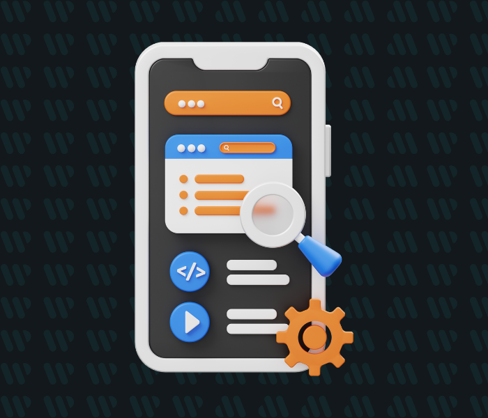
4. What Mobile-First Design Looks Like Today
So, what does a mobile-first website actually look like in 2025?
It’s not just a squished-down version of your desktop site. It’s a site that feels made for the phone. Easy to use. Fast. Focused.
Here’s what mobile-first design for small business looks like in practice:
Key features:
- Large, readable text (no squinting)
- Tap-friendly buttons with plenty of space
- Sticky navigation bars that stay visible as users scroll
- Simplified menus (think hamburger icon—not a row of tiny links)
- Priority content up top (your offer, CTA, or key info shouldn’t be buried)
- Optimized images that load fast and don’t crash mobile data plans
- Short, scannable sections instead of long paragraphs
Want to see more design dos and don’ts?
Our post on Web Design Tips for Small Business breaks down more visual and layout details that apply across devices.
5. How to Make the Switch Without Starting Over
So your site wasn’t built mobile-first. Good news: you don’t need to scrap everything and start from zero.
There are two ways to fix it:
- Tweak what you have.
- Or use a modern solution built for mobile from the ground up.
Either way, shifting to mobile-first design for small business doesn’t have to mean a total overhaul.
Option 1: Tweak and optimize
- Simplify your layout
- Increase font and button sizes
- Test your mobile performance and fix any obvious issues
- Prioritize the content that matters most to mobile users
- Use Google’s Mobile-Friendly Test to find problems fast
- If your site’s decent but just a little dated, this is a great starting point.
For help with cleanup and regular upkeep, see our guide to Website Maintenance.
Option 2: Let WaaS do the heavy lifting
Website as a Service (WaaS) is a smarter way to go mobile-first, especially if you don’t have time to mess with menus, breakpoints, or tech fixes.
With Websity Digital, your new site is:
- Designed mobile-first by default
- Built fast with zero guesswork
- Fully managed, maintained, and optimized
- Focused on conversion, on every screen
Helpful Resources
If you’re serious about making the shift to mobile-first (and you should be), these resources will help you do it right, without the overwhelm:
- Web Design Tips for Small Business
Quick, practical ways to upgrade your site’s design without a full rebuild. - Website Red Flags That Are Costing You Leads
Spot the common mistakes that silently drive mobile users away. - Website Maintenance
Mobile-first isn’t a one-and-done fix. This guide shows how to keep your site running smoothly in the long term. - Website as a Service (WaaS)
Want to go hands-off? Learn how WaaS from Websity Digital can launch and manage your site for you. - Google Mobile-Friendly Test
See if your current site meets Google’s mobile standards in under 30 seconds. - Think with Google: Mobile Site Speed Insights
Free tool to test your site’s mobile performance and see how much business slow load times are costing you.
Build for the Screen That Actually Matters
Mobile isn’t the future. It’s right now, and if your website isn’t keeping up, it’s falling behind.
In 2025, mobile-first design for small business is no longer optional.
It’s how you build trust.
It’s how you show up professionally.
And most importantly, it’s how you convert.
But you don’t need to rebuild from scratch. You just need to rethink how your site appears where your customers already are.
Want a mobile-first website that doesn’t make you do all the work?
Websity Digital helps small businesses launch modern, mobile-optimized sites without stress. With our WaaS model, we handle strategy, design, mobile performance, and support.